I prefer “list” view over grid view. Switching to grid view shows six videos before the break, but significantly less information about the video.
God, Youtube has gone to shit lately.
Lately in this context, meaning about the last 15 or so years.
They added sort from oldest back! wooooooo. One step forward after being launched backwards into a pile of shit.
They only removed it because it interfered with a new feature they added to the mobile app. If they removed it for monetary reasons (like what they did with dislikes), they wouldn’t have brought it back
I don’t give a cunt’s dick why they removed it in the first place, why are you defending anything about it
I’m not defending anything. I think you misunderstood my comment
uBlock Origin makes this easy:
Instructions Screenshot 1. Find a Shorts section on the page 
2. Select the element picker in uBlock Origin 
3. Select the Shorts section 
4. Click “Create” 
5. Enjoy 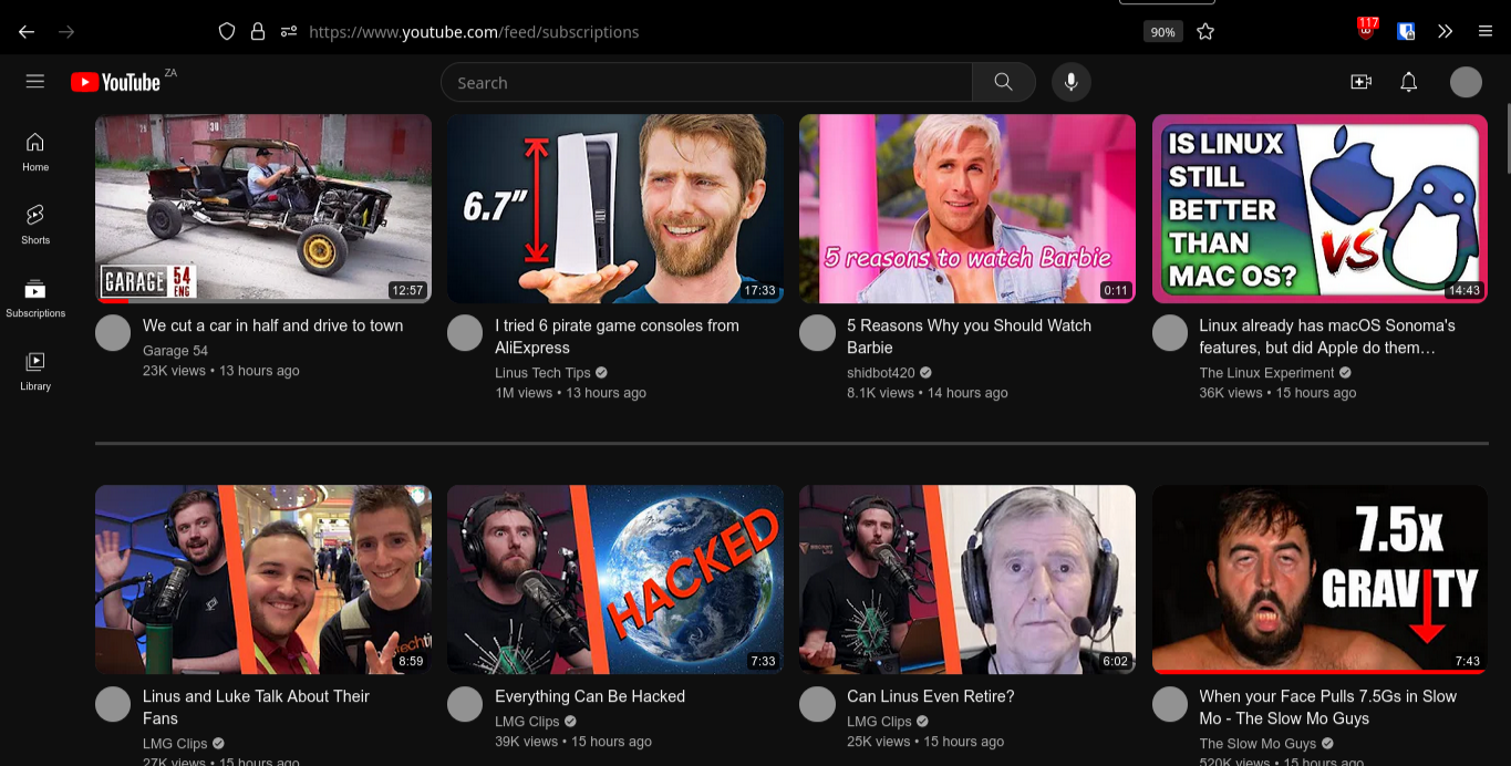
You can also use the “zap” feature. Just use the lightning bolt icon to the left of the eyedropper and it’ll skip step 4. I also found this to work better because selecting shorts ended up always selecting the entire videos section as well.
This is just temporary, if you refresh the page it will show section again.
It was not temporary for me. I had to go into my settings and delete my changes to get it working again.
This is defined as temporary in uBlock documentation.
Reloading the web page will cause all removed elements to return.
Your link talks about the element zapper, the icon that looks like a lightning. The instructions above talk about the element picker, the icon that looks like an eye dropper.
You can also use the “zap” feature. Just use the lightning bolt icon to the left of the eyedropper and it’ll skip step 4. I also found this to work better because selecting shorts ended up always selecting the entire videos section as well.
Unfortunately zapping doesn’t work after refreshing
I would recommend clicking Preview before Create. You know what will be removed before creating a rule is better.
OMG thank you ☺️
Wow cool feature!
Does this work consistenyl? I tried that with Pinterest’s login popup and it doen’t work (the element changes every time you enter the site). I ended up adding a filter to remove all Pinterest results from all my searches.
I did this years ago when it was added to home, not seen shorts since. Good guide.
Youtube added shorts to subscription, and i added Youtube-shorts block to firefox.
Nice one
Same. They can try as much as they want to make it happen, but if people don’t want it, people don’t want it no matter how much they force them.
I hate this format of content so much. An automatically reloading, never ending stream of snippets that are hardly informative even if they try. Fucking looks like they are trying to hypnotize us.
Oh wait, they absolutely are. Stop thinking about not being able to afford a living even though you bust your ass of everyday. Stop worrying about the climate. Get a new iphone and obediently watch citizen.
Trying to hop on that ADHD train.
This is not a defense of TikTok style short form content. It’s just that from time to time, I do enjoy the shorter style videos. Like when I have 5 minutes to kill, watch a few short videos and be on my way.
What I really don’t like is that if you choose the app and the last thing you watched was a short, it opens right back up to to Shorts. Very annoying.
Yeah I occasionally use Instagram and look at reels. Sometimes it’s fun to catch the one snippet from a comedy sketch instead of watching the whole thing.
That said, I wouldn’t miss anything if I deleted it tomorrow.
When I have 5 minutes to kill I open Wikipedia and read the article of the day.
Reading is better for your brain and attention span, and on top of that you learn something new.
I should do this more often. Thanks for the suggestion!
Plus they commit the biggest sin possible in video…VERTICAL VIDEO. I hate this garbage trend of everything being designed for phones. Vertical videos suck. They are terrible to watch on desktop. You can rotate your phone sideways, you can’t rotate your TV, laptop, monitor, projector, etc. vertical (at least not most of the time).
I just hate how much functionality the Shorts player loses compared to the regular Youtube player. They seriously made their product worse to imitate a competitor? Who asked for this?
The shareholders.
I swear that these board of director types are some of the most dense and out of touch people on the planet. It’s crazy how we reward them for their stupidity in exchange for their unbridled greed.
Who asked for this?
Either Susan Wojcicki (ex-YT CEO), Neal Mohan (current YT-CEO) or Sundar Pichai (Google CEO)
And funnily, the shorts player on mobile has some of those features.
Removed by mod
You can use the regular Youtube interface for shorts, I do it everytime I open one:
-
go to a short video
-
replace the
/shorts/part of the URL by/v/ -
??? (trigger warning: old meme)
-
Profit
-
It’s all intentional. They know that overall it increases engagement and that’s all they care about.
Even Instagram and Tiktok let people fast forward videos. YouTube needs to get their shit together.
The zombie clicker demographic is their best customer/product
Fuck YouTube shorts. It’s infuriating that YouTube doesn’t provide us an option to remove all traces of that fuckin cancer from the platform.
My biggest issue is so many of the people I sub that have shorts, the shorts are their normal videos but only a small clip of it. I dont want that, Im already watching the videos!
deleted by creator
If we wanted short clips, we’d be on TikTok damnit!
Exactly. YouTube doesn’t want to lose out on that revenue/time spent on other platforms…
Press the X? Gotcha! I’ll remove shorts for 30 days or until you come back without cookies in 10 minutes.
I don’t mind YouTube shorts usually, although my TikTok feed is far better. But last week, my YouTube app started opening to the shorts tab. Infuriating. I’ll watch a short if it piques my interest, but that’s not what I’m going to YouTube for.
Just add this line to the “My Filters” section for the uBlock Origin extension.
- click the extension in your top bar
- click the “gears” icon/button
- click the “My Filters” tab and add this line :
www.youtube.com###content > .ytd-rich-section-renderer.style-scope
My original mastadon post has screenshots with red guide marks in case this is confusing:
There’s an even more extensive filter list for hiding shorts here: https://letsblock.it/filters/youtube-shorts
Welcome to the worlds best anti-monopoly education. See just why monopolies suck in real time!
Monopolies are problematic, of course, but it’s more than that. Monopolies, especially in the luxury space, still have to compete with consumers making the choice to not consume at all.
It’s more nefarious than that. This is a symptom of “you are the product, not the paying customer”. You get absolutely no say in how to product is used, and worse, your experience will actively be harmed if it means the real client, advertisers, get more value extracted out of you.
Y’all just sheep walking happily into the slaughterhouse, thinking the farmer is here to feed and shelter you, and it’s just missfortune that the farmer has to put you in some dirty cages, when in fact, the farmer does this intentionally because it’s more profitable that way.
Having two factory farms (TikTok) doesn’t make the conditions for the animals better. In fact maybe it even makes it worse, as the farms compete to cut costs.
The real solution is a new buisness model. Organic farms… Or payed video platforms, where the solution provider builds the software for the user, not advertisers.
Anyone get an update on for their TV app this week?
Went from having reasonably-sized thumbnails, to these over-sized ones where only like 2.5 of them fit horizontally and less than 1.5 of them fit vertically. They are obnoxiously huge which means to see what videos are in your feed you have to do a ton of needless scrolling.
Just a week ago, it wasn’t like this - I think you could see 4 horizontally and 3 vertically before which is perfect for a living room experience.
My favorite part is that there is no way to make any adjustments. If you are going to change something like this, at least let me change it back. WTF?
Yes and that is so fucking annoying. Whag a degen ui designers on yt
I don’t get why everyone is so mad about this. When I saw it yesterday, I was glad they finally put them into a separate box I can just scroll past. Before, Shorts were just mixed in between the normal videos in the subscription feed and that was fucking awful.
And before that, they were in a separate section like they are now, but it had a thing you could click to hide that section entirely for 30 days.
Just because it’s less bad than the previous thing doesn’t mean it’s good.
YouTube shorts are awful. Most of them are just incomplete YouTube videos.
I don’t remember them ever in a separate section on the subscription page. Maybe it was just one of google’s A/B testing for some people or I just hid them immediately and forgot. :-)
Would be better if it was possible to hide it, like in home feed. I don’t want to see shorts in my subscription feed. It takes so much space.
oh they moved it finally? i couldnt stand a feed full of annoying shorts making it harder to find actual videos i wanted to watch. i been using an extension for a while and cant go back to what it was then. if at least they are confined to a seperate list its not so bad
I guess your screen isn’t 1366x768
I actually liked when they were together in single box, everything was ordered from newest to oldest and I had extension that redirected shorts to normal player. With separated boxes I feel like there isn’t enough space and now the shorts don’t get the ‘watched red bar’ so I don’t know right away which shorts I’ve already seen, I’m forced to remember the thumbnails now which is annoying.
I do wish they give customization options, so users can decide how to actually use youtube.
It’s sad having a front row seat to The Internet slowly killing itself.
the ad based internet, as it is today was never supposed to work as some people will always block ads meaning more ads pushed to regular users and thus more people using adblock until we hit the break-even point and the site is forced to shut down or do the enshitification thing
Boy am I glad I have the extension that makes shorts invisble
May I ask which extension you are running?
Thanks. I find the Enhancer for YT a bit over kill.
Have you tried pockettube? it allows yyou to create categories so you can bunch your channels together. It’s pretty cool.
How is it that such a shitty site/corporation has continued to maintain a grip on this market? Why aren’t we inundated with viable alternatives?
Hosting video is expensive?
Also fighting copyright claims from the music and movie industry is even more expensive and difficult.
Microsoft (with their Azure) has more than enough storage space. They got CDNs and video streaming technologies (that anyone can use in their own products). But they’ve still given up their own music streaming service and public video upload service.
deleted by creator
Peertube works.
Because it has all the good content. The creators are what makes watching YouTube so fun, not the site itself.
Reduced the amount of videos per row too, had to find a ublock filter for that one.
If anyone is interested: https://pastebin.com/raw/SMVYXFHe


